

#01 Challenge | Delhi's Air Quality Data
Learn how to analyze Time Series data with ARIMA in Python.


Photo by Photoholgic on Unsplash
We have started a biweekly series of challenges in this Study Circle. After considering the topics you have suggested in the comments, we are kicking off with Time Series.
Why this Data topic?
This morning, I read the Economist Espresso on India's pollution season, and I thought it was a good idea to start the series of challenges with this topic.
Getting the Data
After navigating many websites, such as India's Central Pollution Control Board and WHO, I found this website about Air Quality Data where we can download the data from many places worldwide.
I chose Delhi to be the city we will analyze in this challenge.
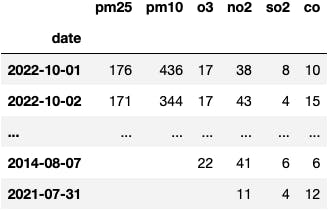
Executing the following lines of code will produce the DataFrame we'll work with:
import pandas as pd

df = pd.read_csv('anand-vihar, delhi-air-quality.csv', parse_dates=['date'], index_col=0)
df
I needed to process the data to deliver a workable dataset in the following way:
#remove whitespaces in columns
df.columns = df.columns.str.strip()

#get the rows with the numbers (some of them where whitespaces)
series = df['pm25'].str.extract('(\w+)')[0]

#rolling average to armonize the data monthly
series_monthly = series.rolling(30).mean()

#remove missing dates
series_monthly = series_monthly.dropna()

#fill missing dates by linear interpolation
series_monthly = series_monthly.interpolate(method='linear')

#sorting the index to later make a reasonable plot
series_monthly = series_monthly.sort_index()

#aggregate the information by month
series_monthly = series_monthly.to_period('M').groupby(level='date').mean()

#process a timestamp to avoid errors with statsmodels' functions
series_monthly = series_monthly.to_timestamp()

#setting freq to avoid errors with statsmodels' functions
series_monthly = series_monthly.asfreq("MS").interpolate()

#change the name of the pandas.Series
series_monthly.name = 'air pollution pm25'
As we don't know the coding skills of this Study Circle member, we'll start with simple ARIMA models. From this point, we will iterate the procedure and improve the dynamic.
To take on the challenge and maybe, receive some feedback, you should fork this repository to your GitHub account. Otherwise, you can download this script.
The end goal is to develop an ARIMA model and plot the predictions against the actual data. Resulting in a plot like the this.
Nevertheless, you can develop this challenge in any way you find attractive. The essential point of this Study Circle is the interactivity between the members to generate value and knowledge.
From your feedback, we could later work on different use cases. For example, we could later create a geospatial map in Python with the predictions.
So, let's get on and good luck!
You start with the following object:
Learning Materials
Check out the following materials to learn how you could develop the challenge:
- Video Tutorial: How to develop ARIMA models to predict Stock Price
Start the challenge
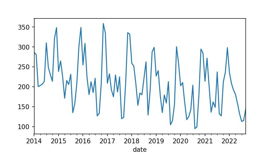
series_monthly
date
2014-01-01    286.023457
2014-02-01    281.428205
                 ...
2022-08-01    115.487097
2022-09-01    143.713333
Freq: MS, Name: air pollution pm25, Length: 105, dtype: float64
It's not the same to observe the data in numbers than in a chart:
series_monthly.plot();
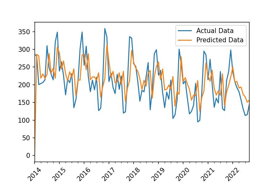
We aim to compute a mathematical equation that we will later use to calculate predictions, as we can see in the following chart:
There are many types of mathematical equations, the one we will use is ARIMA. Don't worry about the maths, we need a Python function to make it all for us.
from statsmodels.tsa.arima.model import ARIMA
The parameters of this Class ask for two objects:
endog: the dataorder: (p,d,q)p: the first significant lag in the Autocorrelation Plotd: the diff needed to make our data stationaryq: the first significant lag in the Partial Autocorrelation Plot
d | Diff to get data stationarity
The first thing we need to check about our data is stationarity. We use the Augmented Dickey-Fuller test intending to reject the null hypothesis in which we state that the data is non-stationary. If that's the case, we need to differentiate the time series and adjust the number d:1 in the parameter order=(p, d:1, q).
from statsmodels.tsa.stattools import adfuller

result = adfuller(series_monthly)
The p-value is given by the second element the function adfuller returns:
result[1]
-> 0.4244071993737921
The p-value is greater than 0.05. Therefore, we can't reject the null hypothesis.
Are we done here?
- No, we can differentiate the Time Series by one lag and test again:
series_monthly_diff_1 = series_monthly.diff().dropna()

result = adfuller(series_monthly_diff_1)
result[1]
-> 2.4066471086483724e-24
We can reject the null hypothesis and say that our data is stationary with a lag of 1. Therefore, we need to set d:1 in the order parameter of the ARIMA() class.
q | Autocorrelation Plot
Now we need to determine q based on the first significant lag of the autocorrelation plot:
from statsmodels.graphics.tsaplots import plot_acf

plot_acf(series_monthly_diff_1, lags=50)
plt.xlabel('Lag');
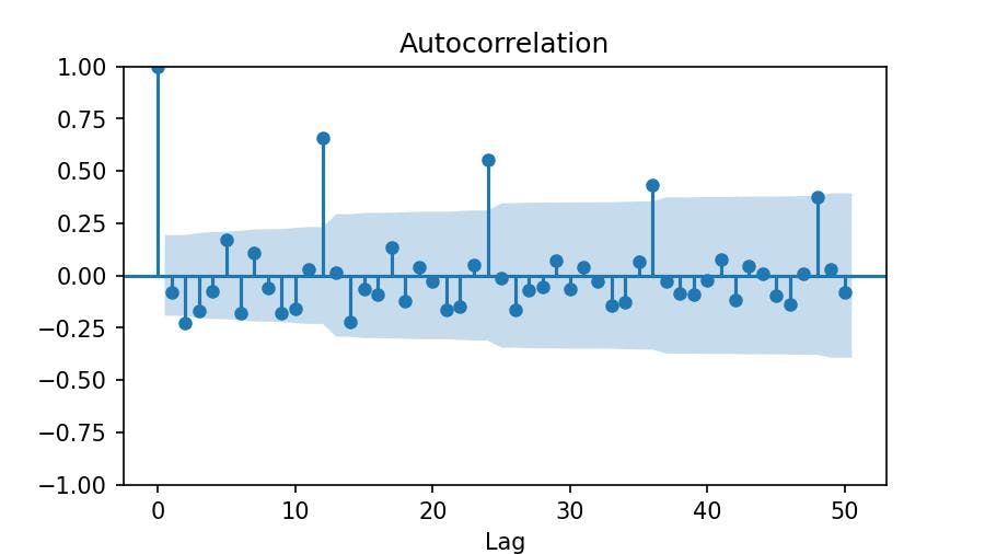
The first significant lag is the 2, which means that our differentiated data (monthly) is correlated every two months. We set q=2.
p | Partial Autocorrelation Plot
We follow the same procedure to choose a number for p. But this time, we use another type of plot: Partial Autocorrelation.
from statsmodels.graphics.tsaplots import plot_pacf

plot_pacf(series_monthly_diff_1, lags=50, method='ywm')
plt.xlabel('Lag');
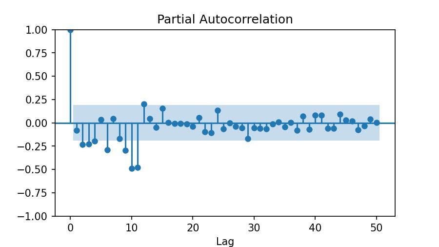
We see the first significant lag at 2. Therefore, we set p=2.
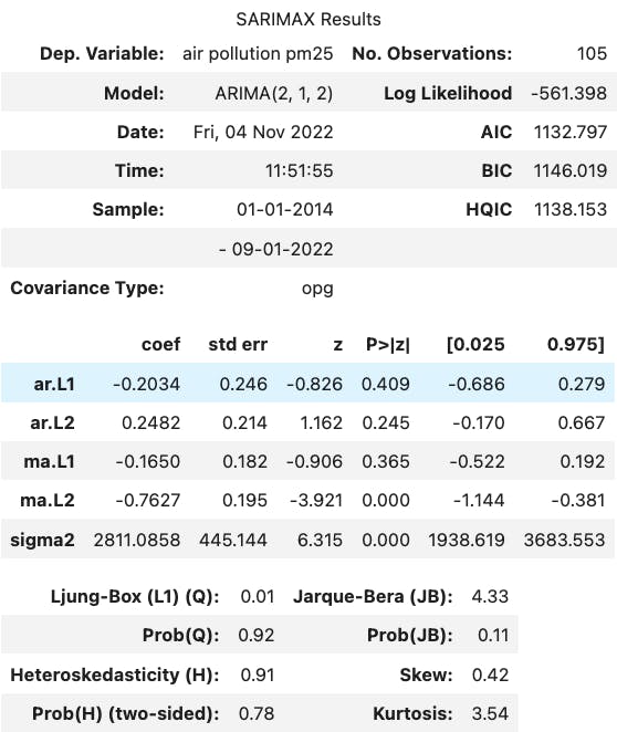
We already know which numbers we set on the order parameter: order=(p:2, d:1, q:2). So, let's fit the mathematical equation of the model.
model = ARIMA(series_monthly, order=(2,1,2))

result = model.fit()
result.summary()
And calculate the predictions:
import matplotlib.pyplot as plt

plt.figure(figsize=(6,4))

series_monthly.plot(label='Actual Data')
result.predict().plot(label='Predicted Data')

plt.legend()
plt.xticks(rotation=45);
