

#06 | The Principal Component Analysis (PCA) & Dimensionality Reduction Techniques
Learn how to group variables to plot seven variables in a 2-dimensional plot and why PCA is an essential technique to visualize clustering models.


© Jesús López 2022
Ask him any doubt on Twitter or LinkedIn
Chapter Importance
We used just two variables out of the seven we had in the whole DataFrame.
We could have computed better cluster models by giving more information to the Machine Learning model. Nevertheless, it would have been harder to plot seven variables with seven axes in a graph.
Is there anything we can do to compute a clustering model with more than two variables and later represent all the points along with their variables?
- Yes, everything is possible with data. As one of my teachers told me: "you can torture the data until it gives you what you want" (sometimes it's unethical, so behave).
We'll develop the code to show you the need for dimensionality reduction techniques. Specifically, the Principal Component Analysis (PCA).
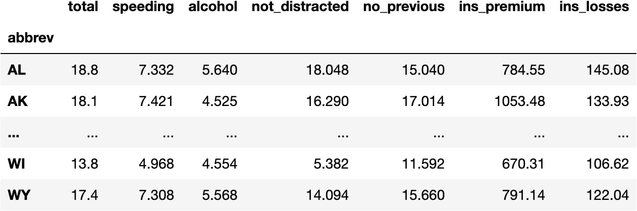
Load the Data
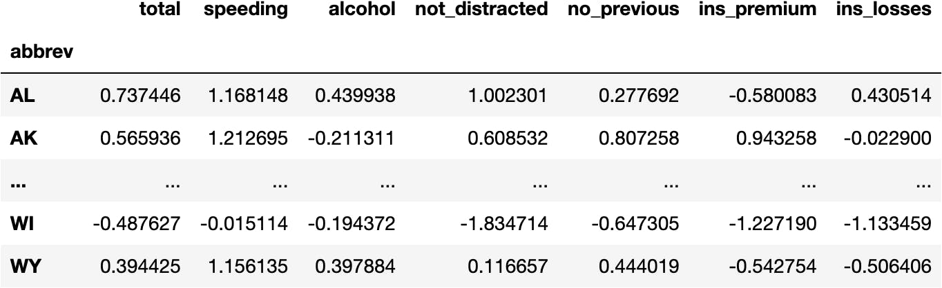
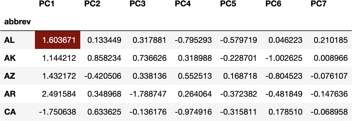
Imagine for a second you are the president of the United States of America, and you are considering creating campaigns to reduce car accidents.
You won't create 51 TV campaigns, one for each of the States of the USA (rows). Instead, you will see which States behave similarly to cluster them into 3 groups based on the variation across their features (columns).
import seaborn as sns #!

df_crashes = sns.load_dataset(name='car_crashes', index_col='abbrev')
df_crashes

Check this website to understand the measures of the following data.
Data Preprocessing
From the previous chapter, we should know that we need to preprocess the Data so that variables with different scales can be compared.
For example, it is not the same to increase 1kg of weight than 1m of height.
We will use StandardScaler() algorithm:
from sklearn.preprocessing import StandardScaler

scaler = StandardScaler()
data_scaled = scaler.fit_transform(df_crashes)
data_scaled[:5]
array([[ 0.73744574,  1.1681476 ,  0.43993758,  1.00230055,  0.27769155,
        -0.58008306,  0.4305138 ],
       [ 0.56593556,  1.2126951 , -0.21131068,  0.60853209,  0.80725756,
         0.94325764, -0.02289992],
       [ 0.68844283,  0.75670887,  0.18761539,  0.45935701,  1.03314134,
         0.0708756 , -0.98177845],
       [ 1.61949811, -0.48361373,  0.54740815,  1.67605228,  1.95169961,
        -0.33770122,  0.32112519],
       [-0.92865317, -0.39952407, -0.8917629 , -0.594276  , -0.89196792,
        -0.04841772,  1.26617765]])
Let's turn the array into a DataFrame for better understanding:
import pandas as pd

df_scaled = pd.DataFrame(data_scaled, index=df_crashes.index, columns=df_crashes.columns)
df_scaled
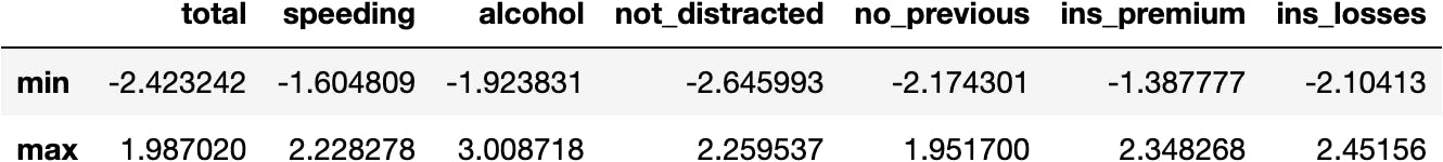
Now we see all the variables having the same scale (i.e., around the same limits):
df_scaled.agg(['min', 'max'])
k-Means Model in Python
We follow the usual Scikit-Learn procedure to develop Machine Learning models.
Import the Class
from sklearn.cluster import KMeans
Instantiate the Class
model_km = KMeans(n_clusters=3)
Fit the Model
model_km.fit(X=df_scaled)
KMeans(n_clusters=3)
Calculate Predictions
model_km.predict(X=df_scaled)
array([1, 1, 1, 1, 2, 0, 2, 1, 2, 1, 0, 1, 0, 0, 0, 0, 0, 1, 1, 0, 2, 2,
       2, 2, 0, 1, 1, 0, 0, 0, 2, 0, 2, 1, 1, 0, 1, 0, 1, 2, 1, 1, 1, 1,
       0, 0, 0, 0, 1, 0, 1], dtype=int32)
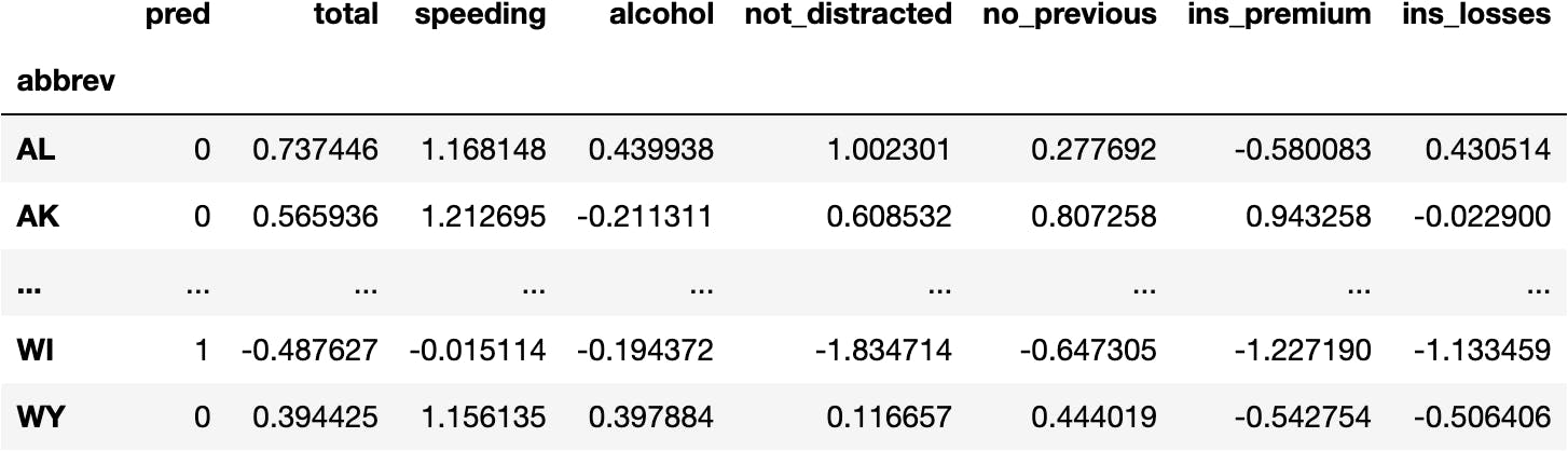
Create a New DataFrame for the Predictions
df_pred = df_scaled.copy()
Create a New Column for the Predictions
df_pred.insert(0, 'pred', model_km.predict(X=df_scaled))
df_pred
Visualize the Model
Now let's visualize the clusters with a 2-axis plot:
sns.scatterplot(x='total', y='speeding', hue='pred',
                data=df_pred, palette='Set1');
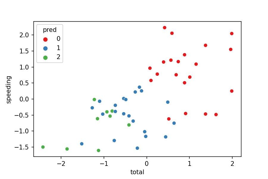
Model Interpretation
Does the visualization make sense?
- No, because the clusters should separate their points from others. Nevertheless, we see some green points in the middle of the blue cluster.
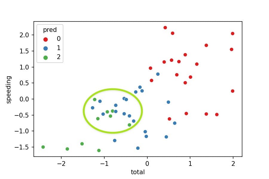
Why is this happening?
- We are just representing 2 variables where the model was fitted with 7 variables. We can't see the points separated as we miss 5 variables in the plot.
Why don't we add 5 variables to the plot then?
- We could, but it'd be a way too hard to interpret.
Then, what could we do?
- We can apply PCA, a dimensionality reduction technique. Take a look at the following video to understand this concept:
Grouping Variables with PCA()
Transform Data to Components
PCA() is another technique used to transform data.
How has the data been manipulated so far?
- Original Data
df_crashes
df_crashes
- Normalized Data
df_scaled
df_scaled

- Principal Components Data
dfpca(now)
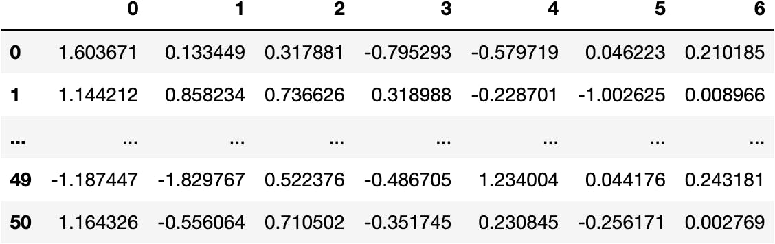
from sklearn.decomposition import PCA

pca = PCA()
data_pca = pca.fit_transform(df_scaled)
data_pca[:5]
array([[ 1.60367129,  0.13344927,  0.31788093, -0.79529296, -0.57971878,
         0.04622256,  0.21018495],
       [ 1.14421188,  0.85823399,  0.73662642,  0.31898763, -0.22870123,
        -1.00262531,  0.00896585],
       [ 1.43217197, -0.42050562,  0.3381364 ,  0.55251314,  0.16871805,
        -0.80452278, -0.07610742],
       [ 2.49158352,  0.34896812, -1.78874742,  0.26406388, -0.37238226,
        -0.48184939, -0.14763646],
       [-1.75063825,  0.63362517, -0.1361758 , -0.97491605, -0.31581147,
         0.17850962, -0.06895829]])
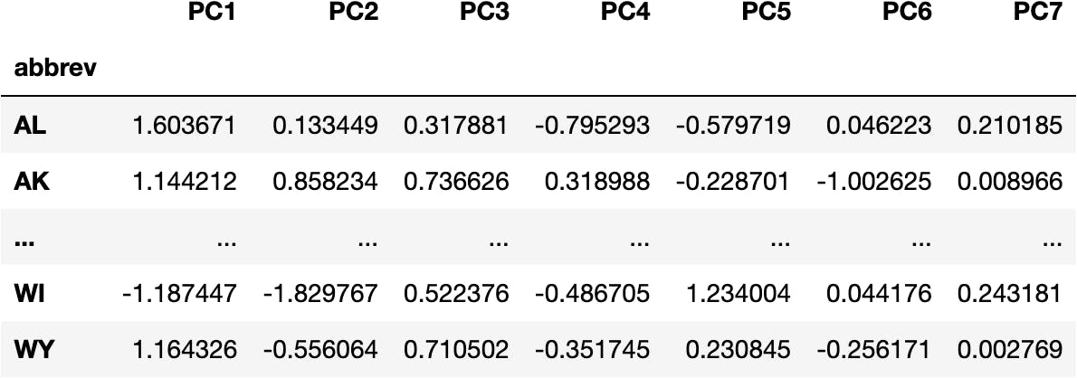
df_pca = pd.DataFrame(data_pca)
df_pca
cols_pca = [f'PC{i}' for i in range(1, pca.n_components_+1)]
cols_pca
['PC1', 'PC2', 'PC3', 'PC4', 'PC5', 'PC6', 'PC7']
df_pca = pd.DataFrame(data_pca, columns=cols_pca, index=df_crashes.index)
df_pca
Visualize Components & Clusters
Let's visualize a scatterplot with PC1 & PC2 and colour points by cluster:
import plotly.express as px

px.scatter(data_frame=df_pca, x='PC1', y='PC2', color=df_pred.pred)
Are they mixed now?
- No, they aren't.
That's because both PC1 and PC2 represent almost 80% of the variability of the original seven variables.
You can see the following array, where every element represents the amount of variability explained by every component:
pca.explained_variance_ratio_
array([0.57342168, 0.22543042, 0.07865743, 0.05007557, 0.04011   ,
       0.02837999, 0.00392491])
And the accumulated variability (79.88% until PC2):
pca.explained_variance_ratio_.cumsum()
array([0.57342168, 0.7988521 , 0.87750953, 0.9275851 , 0.9676951 ,
       0.99607509, 1.        ])
Which variables represent these two components?
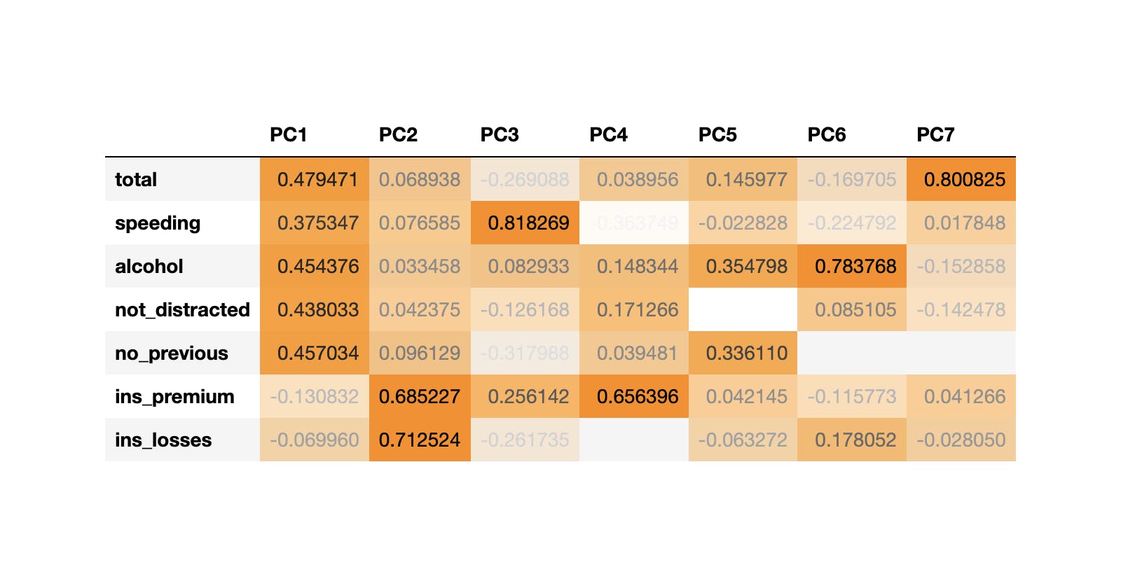
Relationship between Original Variables & Components
Loading Vectors
The Principal Components are produced by a mathematical equation (once again), which is composed of the following weights:
df_weights = pd.DataFrame(pca.components_.T, columns=df_pca.columns, index=df_scaled.columns)
df_weights
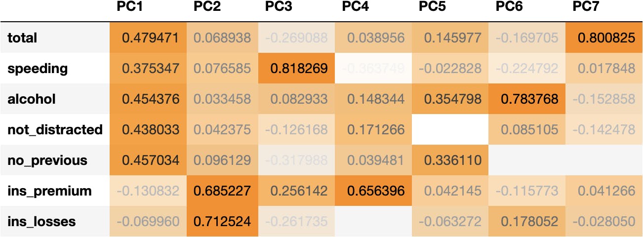
We can observe that:
- Socio-demographical features (total, speeding, alcohol, not_distracted & no_previous) have higher coefficients (higher influence) in PC1.
- Whereas insurance features (ins_premium & ins_losses) have higher coefficients in PC2.
Principal Components is a technique that gathers the maximum variability of a set of features (variables) into Components.
Therefore, the two first Principal Components accurate a good amount of common data because we see two sets of variables that are correlated with each other:
Correlation Matrix
df_corr = df_scaled.corr()
sns.heatmap(df_corr, annot=True, vmin=0, vmax=1);
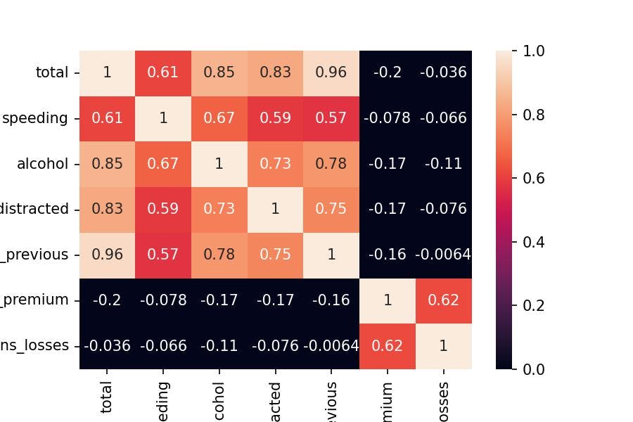
I hope that everything is making sense so far.
To ultimate the explanation, you can see below how df_pca values are computed:
Calculating One PCA Value
For example, we can multiply the weights of PC1 with the original variables for ALabama:
(df_weights['PC1']*df_scaled.loc['AL']).sum()
1.6036712920638672
To get the transformed value of the Principal Component 1 for ALabama State:
df_pca.head()
The same operation applies to any value of
df_pca.
PCA & Cluster Interpretation
Now, let's go back to the PCA plot:
px.scatter(data_frame=df_pca, x='PC1', y='PC2', color=df_pred.pred.astype(str))
How can we interpret the clusters with the components?
Let's add information to the points thanks to animated plots from plotly library:
hover = '''
<b>%{customdata[0]}</b><br><br>
PC1: %{x}<br>
Total: %{customdata[1]}<br>
Alcohol: %{customdata[2]}<br><br>
PC2: %{y}<br>
Ins Losses: %{customdata[3]}<br>
Ins Premium: %{customdata[4]}
'''

fig = px.scatter(data_frame=df_pca, x='PC1', y='PC2',
                 color=df_pred.pred.astype(str),
                 hover_data=[df_pca.index, df_crashes.total, df_crashes.alcohol,
                             df_crashes.ins_losses, df_crashes.ins_premium])

fig.update_traces(hovertemplate = hover)
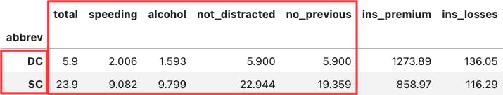
If you hover the mouse over the two most extreme points along the x-axis, you can see that their values coincide with the min and max values across socio-demographical features:
df_crashes.agg(['min', 'max'])
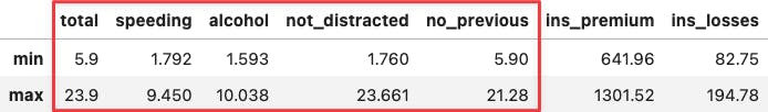
df_crashes.loc[['DC', 'SC'],:]
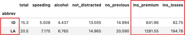
Apply the same reasoning over the two most extreme points along the y-axis. You will see the same for the insurance variables because they determine the positioning of the PC2 (y-axis).
df_crashes.agg(['min', 'max'])
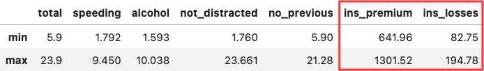
df_crashes.loc[['ID', 'LA'],:]
Is there a way to represent the weights of the original data for the Principal Components and the points?
That's called a Biplot, which we will see later.
Biplot
We can observe how we position the points along the loadings vectors. Friendly reminder: the loading vectors are the weights of the original variables in each Principal Component.
import numpy as np

loadings = pca.components_.T * np.sqrt(pca.explained_variance_)
evr = pca.explained_variance_ratio_.round(2)

fig = px.scatter(df_pca, x='PC1', y='PC2',
                 color=model_km.labels_.astype(str),
                 hover_name=df_pca.index,
                labels={
                    'PC1': f'PC1 ~ {evr[0]}%',
                    'PC2': f'PC2 ~ {evr[1]}%'
                })

for i, feature in enumerate(df_scaled.columns):
    fig.add_shape(
        type='line',
        x0=0, y0=0,
        x1=loadings[i, 0],
        y1=loadings[i, 1],
        line=dict(color="red",width=3)
    )
    fig.add_annotation(
        x=loadings[i, 0],
        y=loadings[i, 1],
        ax=0, ay=0,
        xanchor="center",
        yanchor="bottom",
        text=feature,
    )

fig.show()
Conclusion
Dimensionality Reduction techniques have many more applications, but I hope you got the essence: they are great for grouping variables that behave similarly and later visualising many variables in just one component.
In short, you are simplifying the information of the data. In this example, we simplify the data from plotting seven to only two dimensions. Although we don't get this for free because we explain around 80% of the data's original variability.

This work is licensed under a Creative Commons Attribution-NonCommercial-NoDerivatives 4.0 International License.