How to Analyze Data through Visualization
This tutorial will help you understand how Data Visualization can help to analyse patterns that may result in a Linear Regression model

I coach people to develop the Resolving Discipline that turns them into independent programmers.
What is a plot?
- A visual representation of the data
Which data? How is it usually structured?
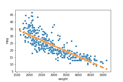
- In a table. For example:
import seaborn as sns

df = sns.load_dataset('mpg', index_col='name')
df.head()
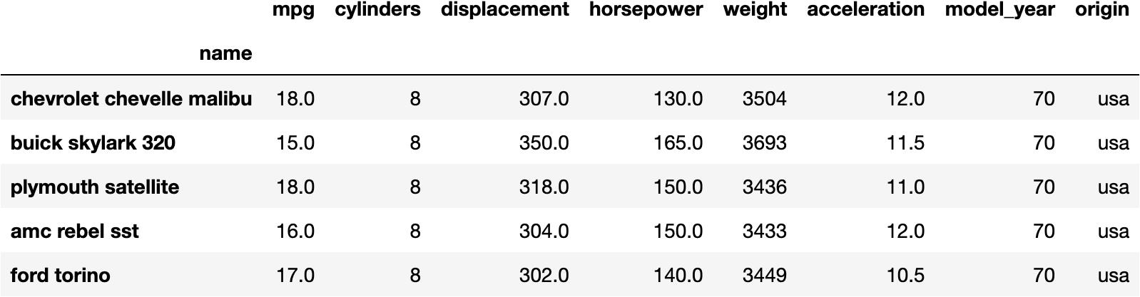
How can you Visualice this DataFrame?
- We could make a point for every car based on
- weight
- mpg
sns.scatterplot(x='weight', y='mpg', data=df);
Which conclusions can you make out of this plot?
Well, you may observe that the location of the points are descending as we move to the right
This means that the
weightof the car may produce a lower capacity to make kilometresmpg
How can you measure this relationship?
- Linear Regression
from sklearn.linear_model import LinearRegression

model = LinearRegression()
model.fit(X=df[['weight']], y=df.mpg)
model.__dict__
- Resulting in ↓
{'fit_intercept': True,
 'normalize': False,
 'copy_X': True,
 'n_jobs': None,
 'n_features_in_': 1,
 'coef_': array([-0.00767661]),
 '_residues': 7474.8140143821,
 'rank_': 1,
 'singular_': array([16873.20281508]),
 'intercept_': 46.31736442026565}
Which is the mathematical formula for this relationship?
$$mpg = 46.31 - 0.00767 \cdot weight$$
- This equation means that the
mpggets 0.00767 units lower for every unit thatweightincreases.
Could you visualise this equation in a plot?
- Absolutely, we could make the predictions from the original data and plot them.
Predictions
y_pred = model.predict(X=df[['weight']])

dfsel = df[['weight', 'mpg']].copy()
dfsel['prediction'] = y_pred

dfsel.head()
| weight | mpg | prediction | |
|---|---|---|---|
| name | |||
| chevrolet chevelle malibu | 3504 | 18.0 | 19.418523 |
| buick skylark 320 | 3693 | 15.0 | 17.967643 |
| plymouth satellite | 3436 | 18.0 | 19.940532 |
| amc rebel sst | 3433 | 16.0 | 19.963562 |
| ford torino | 3449 | 17.0 | 19.840736 |
Out of this table, you could observe that predictions don't exactly match the reality, but it approximates.
For example, Ford Torino's
mpgis 17.0, but our model predicts 19.84.
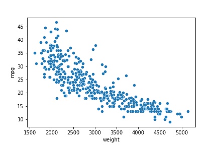
Model Visualization
sns.scatterplot(x='weight', y='mpg', data=dfsel)
sns.scatterplot(x='weight', y='prediction', data=dfsel);
- The blue points represent the actual data.
- The orange points represent the predictions of the model.
I teach Python, R, Statistics & Data Science. I like to produce content that helps people to understand these topics better.
Feel free and welcomed to give me feedback as I would like to make my tutorials clearer and generate content that interests you 🤗
You can see my Tutor Profile here if you need Private Tutoring lessons.